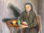
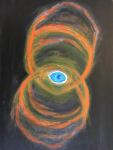
Acrylic paintings, pencil and ink drawings / Click on any piece for a larger view For commentary, scroll past first 16 pieces.


Since Steve passed away one of the most common comments I’ve heard went something like this: “I knew Steve painted but I didn’t know he was so good.” Many people didn’t know he drew or painted at all. I think it’s a testament to Steve’s modest nature, but unfortunate as well, as he never really got the recognition I think he deserved, and his art, to some extent, went underappreciated. But here it is now for the world to see.
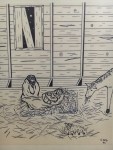
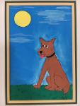
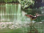
The first 16 pieces above are presented in chronological order, as best as I can approximate. As the years go by it’s easy to lose track of what came next. I have tried to attach a year to each as close as I can get, but will admit I may be off by as much as several years on a few. It hardly matters anyway, and in any case, you can tell by a casual perusal how Steve improved and developed as time went on. Now that he is gone, it is quite an image to think of Steve labouring with the colours and brushstrokes long hours over small details, often months at a time on a single piece, alone in the late hours in his apartment.
I wish I could comment comprehensively on Steve’s influences, specific likes and dislikes but that has proven to be an elusive endeavor. I’m not very knowledgeable about art history and styles, and I’m somewhat regretful of not having that fuller understanding of Steve, of not being able to open up that part of Steve to you more fully and clearly. But I know he loved classical art, some romanticism, the impressionists, Van Gogh and even had a positive word for many modernists. The latter was a tougher sell, however! And post-modernism? Well, that gets a bit complicated . . .
There are no titles for the first 16 pieces above. Steve found the idea of titles to be something of an annoyance, and we always had a good laugh about that when naming our songs, because I felt the same way. We named many of our songs only out of necessity, had nicknames or even multiple names for some of our songs.
∆
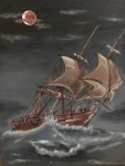
The next group of paintings are pieces Steve created for the cover of our CD, Into the Water. Each song on the CD had a companion image, and they were set out together on the cover as a collage (see the section Steve’s Music), so the caption below each individual painting is the song title. Steve and I decided together that it would be a great idea to do that for the recording. He laboured and laboured intensely over 3 or 4 pieces, but soon came to me and complained that it could easily take a couple of years to complete 12 paintings up to the standard that he really wanted. Naturally we didn’t want to wait that long to release our CD! After much discussion, we decided that it might work to do a bit of a rush job on the remaining 8 or 9 titles, and that they might turn out well enough for photographing for the CD cover. So a rush job he did and everything turned out fine, and those pieces are still quite evocative. As mentioned, there a total of 12 pieces; the song Into the Water has no accompanying painting. The painting for the song Will and Margaret is in the section above (the fiddler).


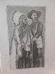

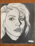
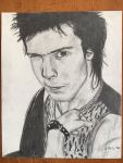
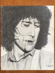
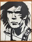
The following drawings represent an interesting part of Steve’s time as an artist. As you can see when you go to the larger versions, these all date from 1982, the same time as the Keith Richards drawing above. Memory is not a trustworthy thing, but here goes: I think some of us were encouraging Steve to do something with his abilities that could earn him some cash – become a working artist, in other words. He hated his daytime job and was looking for a way out. After much encouragement he decided he might have a go at it and possibly set up a booth somewhere downtown; maybe Queen West or Yonge St. So he got to work on the pieces below. I don’t recall how long he worked on them, but he soon decided he was definitely not going to churn out rock star portraits for a living (or non-living) – that wasn’t his thing and that wasn’t art. So here we are with seven portraits all perfectly preserved, wrapped in special tissue, unframed. When Maureen found them in his apartment after he died she showed them to us – the memories, such as they are, came flooding back from 36 years ago. But the drawings and the paper they are on look like they are brand new.
Wondering why he chose to draw the particular musicians he chose? My guess is it’s a bit of a mix. Those that might be most commercially viable and those that he might be inclined to draw anyway. Guess which group David Lee Roth fits into.
By the way, the Keith Richards drawing above is six times the size of those below !